|
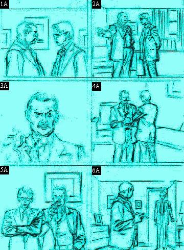
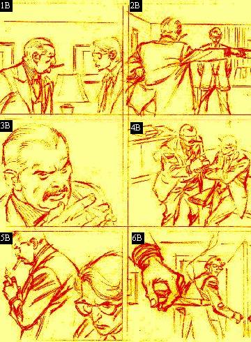
Improper & proper storyboarding techniques continued. Note how each shot of the first series drastically changes in the second series.
1) First shot (1A) shows our two co-workers having a chat. By leaning the older guy into the younger one (1B) we get the impression that this is not a "friendly" discussion. {{PROPS!!}} Notice how the lamp does a nice job breaking up the back/foreground.
2) The first image (2A): Too far away for any impact. What exactly is he pointing to?? The second image (2B): Moving the camera 90 degrees puts the viewer in the shoes of the "boss and his speech."
3) Okay, this shot (3A) is nice... if you're painting a portrait! Positioning the camera up higher and tilting down gives us a much more impressionable image (3B).
4) Image (4A) doesn't have much energy at all but by moving in closer (4B) and once again shooting from up high, the message comes across a lot stronger.
5) First image (5A): Hey look. It's BEAVIS and BUTTHEAD! Now the second shot (5B) is much improved and shows us the disgust in the younger worker's eyes.
6) Once again, we are too far away (6A). The viewer doesn't feel "involved" in the scene. The second shot (6B) is much more dramatic. CU of the cigar makes us feel like we're in a "Hitchcock" film.
|