|
To understand the functions of a storyboard, one must first become familiar with some of the terms involved. Terms such as close-up (CU), medium-shot (MS), long-shot (LS), two-shot, over-the-shoulder shot, and birds-eye view would probably seem foreign to the casual comic book reader. But unknown to them, by familiarizing themselves with the comic page, they have subconsciously studied some of the most basic elements of composing a storyboard.
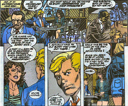
The first image is our establishing LS. Notice how our two "leads" sit off center in the background while the 2 guys in the foreground (up front) help anchor the scene.
Next image is your standard two-shot with an over-the-shoulder variation thrown in.
Next is a CU of Johnny Storm aka the Human Torch.
Final image pulls us back from the scene (as it ends) giving us the sensation once again of foreground and background.
This first example has provided us with the basic set-up for a standard film scene.
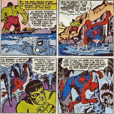
Our first image is an interesting usage of above / below water-level surface.
Next three images play with the concept of background / foreground giving the reader the sensation of Spider-Man's tailing of the Hulk.
Artist Steve Ditko uses a canted angle shot in image # 3, showing us that the cavern's floor isn't all too level.
The last shot shows the Hulk growing smaller, into the shadows, as he appears to travel further down into the cavern.
Despite the fact that this was drawn on a two dimensional piece of paper, the juxtaposition of foreground / background has provided the viewer the impression of movement and distance. In doing so, this has created drama in which one can sense the anxiety Spidey is experiencing.
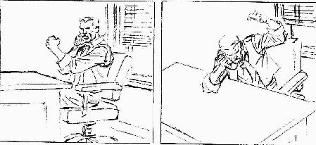
First image: J. Jonah Jameson chatting away on the phone.
Very basic shot, yes? Nothing too exciting happening here.
Now the second shot (by tilting the camera and angling down) creates a much more intense moment. It allows us to feel that the party on the other end of the line (probably poor Parker) is receiving a major ass-chewing.
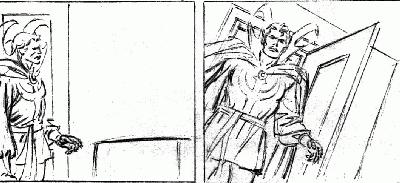
The first image shows an entrance by Dr. Strange (yawn!). Take note of all the wasted space on the right side of the frame.
By pivoting the camera ninety degrees and slightly canting the angling to the side and up, we've created a much bolder impression that now shouts: "I HAVE ARRIVED!"
Notice how the subject "fills" the entire frame. There is no wasted headroom or leadroom. (Hitchcock would be proud).
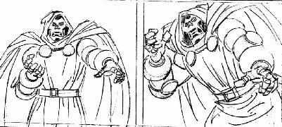
First image evokes the response, "Sighhh.... is it Halloween already?"
But the second image -- with a tilt up and to the side, creates much more drama. Now our reaction is: "Run for the hills everyone! It's DOCTOR DOOM!!!"
And yet, this tension was created without the use of special effects or editing. All it took was a simple change in camera composition.
You'll see why the frames on the left don't stand much of a chance when compared to the same frames on the right.
|
