|
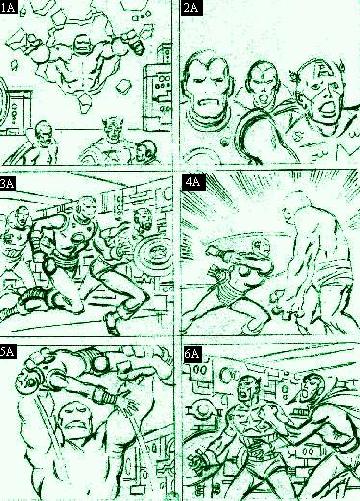
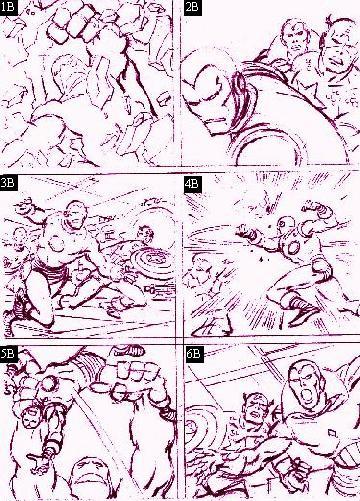
On this page and the next we will examine two sets of similar storyboards. Similar in that they both feature the same scene, however, vastly different in the way they're presented. Let's begin with a typical day at the Avengers' mansion.
1) The first image (1A) is too far away for any kind of impact. Now, the second image (1B) features a CU of the monster bursting through the concrete creating a greater sensation of impending danger.
2) Image (2A) is too flat; the characters looks like puppets. Though there's no movement in (2B), the impression of motion is created due to the placement of the characters. Much better.
3) Our first shot (3A) shows our heroes moving into battle ... YAWN! By slightly bringing the camera down and tilting up (3B) we have created a "rush" as the Avengers rush their opponent.
4) Image (4A): Iron Man hits the monster; no impact whatsoever. Image (4B): Pivoting the camera 90 degrees creates a more dynamic impact. Now, that's a PUNCH!
5) First shot (5A) shows Iron Man hoisted by the monster; nothing spectacular. Now, the second shot (5B), by shooting from a lower angle and focusing more on Iron Man, creates the sensation of "lift."
6) First image (6A) is supposed to be a reaction shot yet it doesn't look like much. The second image (6B) brings us in closer. We can now feel the distress Cap & the Vision are feeling.
Okay, so maybe you're thinking, "Well that works great if you're drawing a comic book but what if you're drawing a storyboard with real images?" Fair enough question. Next is another set of examples; this time depicting two everyday guys conversing.
|

